Bantr App Launch
Bantr is a social network for television fans that launched in the App Store in March 2023. Users can swipe through discussion prompts about their favorite shows to comment, rant, commiserate, bond and bantr with other fans in a one stop discovery platform that simplifies content chaos.
As the first product design hire brought on in the early stages of app development, I helped bring the user experience to life. I worked closely with the founding team to translate big ideas into a sleek, elegantly designed experience for the MVP version of the app.
ROLE: UX, UI Designer

Onboarding Splash Screen
To get started, users create an account with their phone number, choose a creative screen name and tell us what shows they’re watching.
Home Screen
Next, users choose which show they want to bantr about first. They can see what’s trending and featured to help them discover new shows.
Progress Check Screen
Upon choosing a show to bantr about, users let us know how far they’ve watched to avoid being riddle with spoilers.

Discussion Prompts
Spoiler-Free Experience
Fans are matched with episode-based content and other users that are at the same viewing pace to ensure they never have to worry about spoilers.
Engagement
Users can choose to enter a live chat to participate in small group discussions, or view and leave comments in the comment thread.
Early and organic traction in the first 30 days
1k+
Downloads since March 21st launch
on App Store & Google Play
+37%
Active user rate over last 30 days
5★
5-Star rating on App Store
& Google Play
100+
User research touchpoints

Small Group Discussion
Maintaining Anonymity
Users only know each other by their screen names - just like AOL Instant Messenger back in the day.
Deep Engagement
This helps the conversation stay focused on connecting about the discussion prompt and the selected TV show, as opposed to other social platforms like Reddit or Twitter.

Comment Threads
Another Way to Engage
For those fans who aren’t ready to commit to a small group discussion, they can still browse comments others have left on a a particular discussion prompt.
Popularity Ranking
Over time, the data we collect around overall prompt engagement will help us rank prompts by popularity.
Process & Ideation
Preliminary User Flows
Before exploring any of the UI, it’s important to nail down the user experience. This flow mapped out what a first time user journey would look like to ensure we made a good first impression.
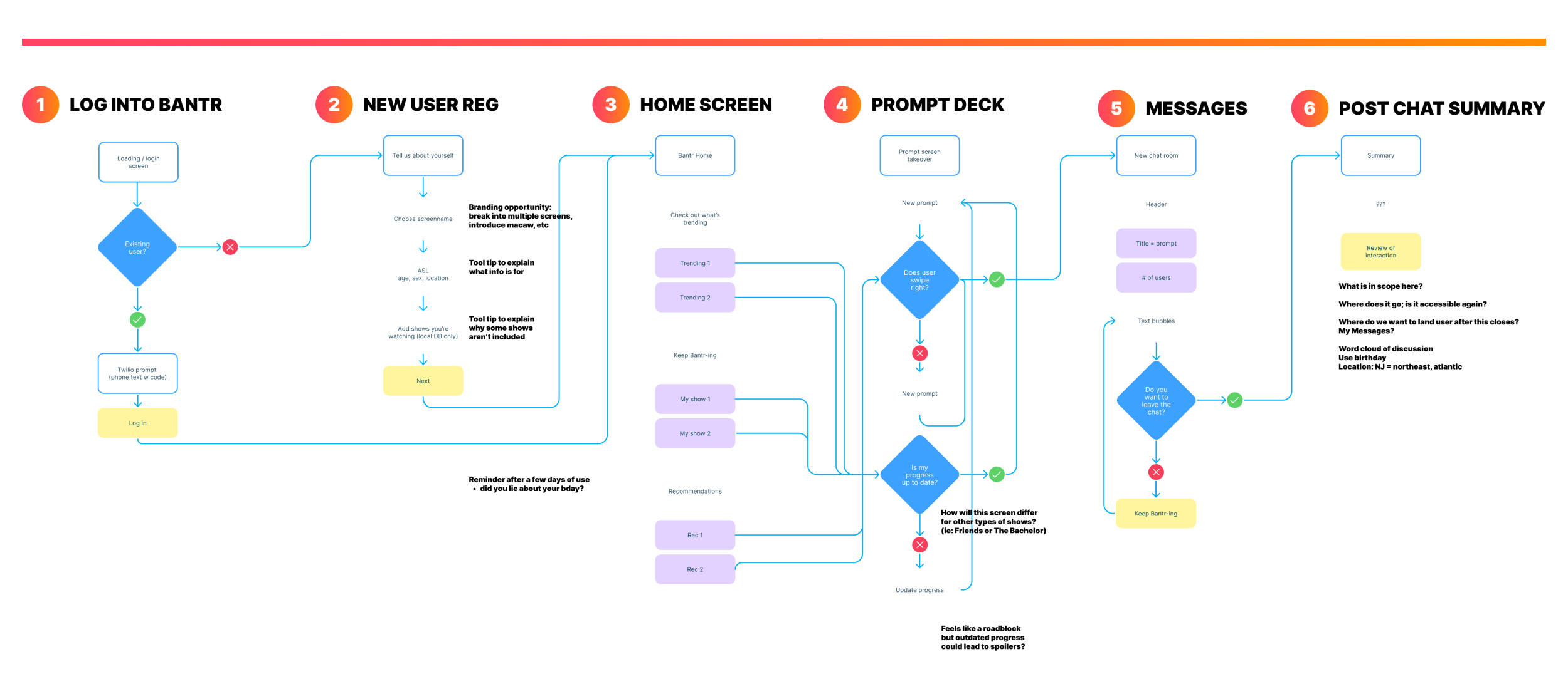
Crucial Initial User Testing Findings
Getting the navigation in the prompt deck right was important since prompts serve as the main gateway to user engagement. I helped lead 1:1 user interviews where we led customers through a beta version of the app to gain important insights and catch major UX hangups. We then incorporated this feedback and data into the product before launch.

The Problems
Swipe Interaction
Users understood quickly that they could swipe through different discussion prompts similar to dating apps.
Icon Confusion
This led to confusion around the meaning of the icons. Some thought the green check and red X icons meant approve/deny or agree/disagree rather than forward/back.
Comments Over Chat
Due to the usability issues noted above, users didn’t understand the difference between comments and chat. Some even thought that the iconography was tied to comments.
The Solutions
Swipe Interaction
We kept the interaction the same, but added a pagination component beneath to visually reiterate the navigation.
A Better Button
We chose to separate the green check icon from it’s dual meaning. Instead, we added a CTA that clearly let’s users know that by clicking on it, they will enter a live chat.
Dual Engagement
This separation created a more balanced hierarchy between comments and chat, which helped more clearly establish the two types of engagement options on each prompt.
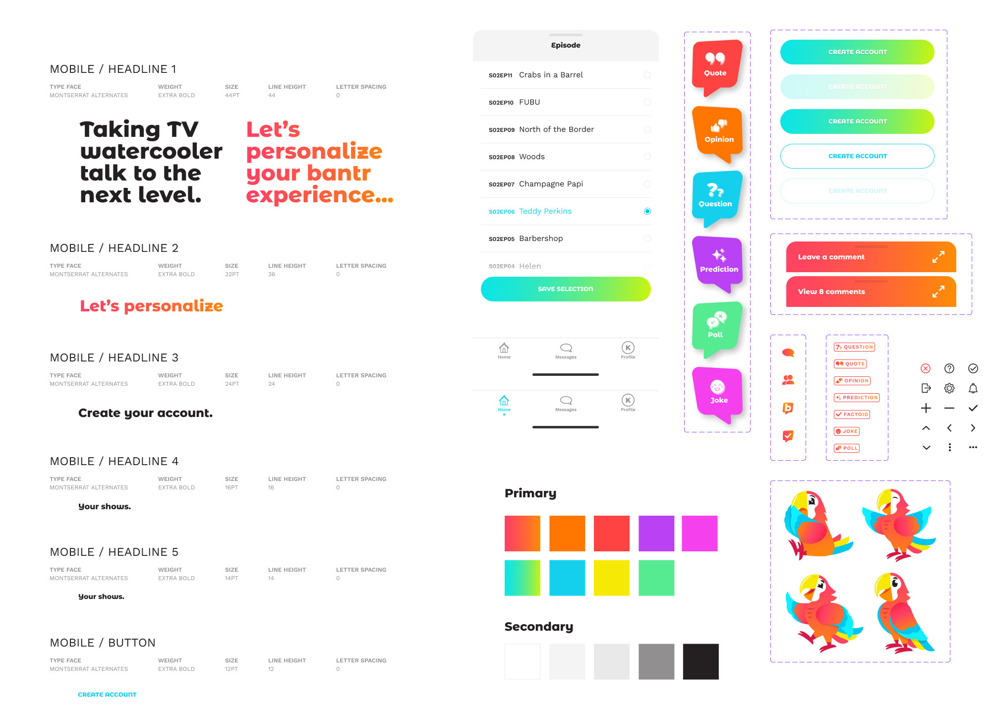
Design System & Style Library
Building off of the established brand guidelines, it was important that the front-end experience carry out the same vibrant, welcoming, and engaging look and feel. The user experience consists of distinctive brand assets that feel culturally relevant, but still let the TV art shine.
Marketing Launch Support
App Store Screens

I created screenshots and app previews to visually communicate Bantr’s user experience for launch on the App Store and Google Play.
Instagram Grid
Lastly, we continued the brand story over to Bantr’s social channels to help organically spread the word about the app launch. We chose to design an initial grid showing off the experience.

COLLABORATORS: Miz Stunja, Product Manager; Ben Laures, Head of Product; Taco Bell Design, Branding Agency