
Beachbody On Demand: Search
The implementation of a search functionality to web, mobile apps, and the Beachbody bike had an overarching goal of engaging the consumer and retaining them as a subscriber over multiple years. We wanted users to discover the breadth of health, fitness and commerce offerings – and to take advantage of incremental revenue opportunities while retaining them in the ecosystem.
As the Project Lead, I designed and managed the entire cross-platform initiative from inception to completion, working closely with product, engineering and development partners to ensure the final design solution met business needs and created a more seamless user experience where customer navigation could be refined in a way that was more intuitive.
ROLE: Project Lead; UI Designer

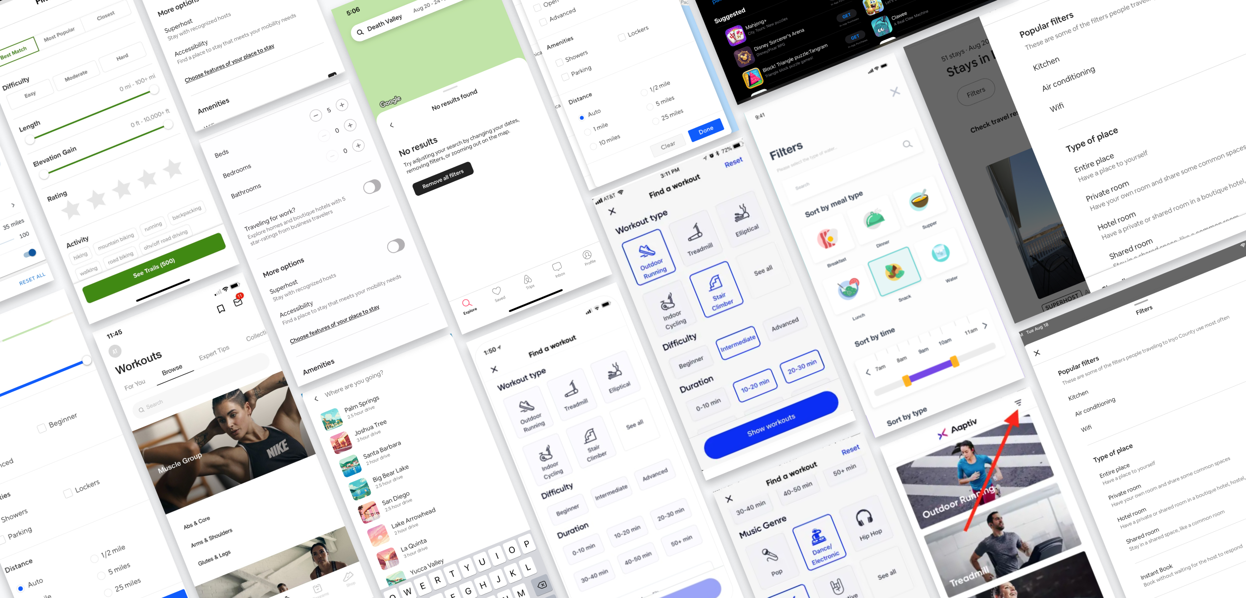
Smart Queries
The autocomplete layout provides ‘as-you-type’ rich content results, which allows users to expand their journey and surface content across categories that otherwise may not be found.
Results Landing Page
Users can see a preview of top results across all categories that yield a result. This reduces the cognitive load for users as they understand the results in each bucket.
Facets & Filters
Users can also use filters to further refine their search results, making it easier for them to discover exactly what they are looking for. Each content category has a custom set of filters.
This project led to improved engagement with products (retail) and content (media).
Increased product and content page views resulted in thousands of incremental orders, translating to several millions in incremental revenue.
33M+
searches monthly
1M+
click conversions in first year
1,000s
of incremental orders

Search on Desktop
& Mobile Web
Secondary Tab Navigation
This component on the web experience allows users to quickly shortcut to a specific results category in order to further filter contents. The top 5 most relevant results categories are shown, and the remainder live under the ‘more’ dropdown to reduce cognitive load.

Search on the Beachbody Bike
Category Icons
This added another visual option for users to quickly sort content by given the larger, tappable nature of the screen. Clicking on an icon yields the same results as choosing it’s respective filter.
Alternate Layout
The UI was reconfigured to better suit the dark, horizontal dark touchscreen bike experience. The filters were set up horizontally to maintain a visual grid experience for the content below.
Reactions from Beachbody Coaches
“For new users thinking Beachbody is just workouts — this is a great way to see all the different resources, food options, the blog, etc.”
— Coach Katie, Emerald Level
“This makes it easier and faster to find content, saving time. Today it's a lot of effort to find things, especially if you're new."
— Coach Sammy, 2 Star Diamond Level
Design System Preview

The search design system contained many different assets with varying states. There was a major difference between the solutions for native app components vs. web components to account for the difference in both UX and technical limitations. All components and data had to react to active and inactive states to show users how the search results changed as different filters were applied. This solution also had to sync up with Beachbody’s internal CMS dataset.
Workout Category Icon Set
Process & Ideation
Competitive Research
Knowing what Beachbody’s competitors were doing was crucial to help stay ahead of trends and figure out how to differentiate our user’s search experience.
COLLABORATORS: Anish Raguraman, Product Manager; David Ramirez, UI Designer